Foodsy
Foodsy is a restaurant discovery app that helps users quickly and enjoyably choose where to eat by offering personalized, visually-driven recommendations based on their cravings and dietary preferences.

Introduction
Welcome to a deep dive into one of my favourite projects - Foodsy, a restaurant discovery app designed to make choosing what to eat effortless and enjoyable. This project began with a simple question: why is deciding where to eat still so frustrating?
In this case study, I’ll walk through how I transformed that question into a fully realized product. From identifying user pain points to designing a visually-driven, personalized experience, this journey highlights my approach to problem-solving, product thinking, and user-centred design.
Challenge
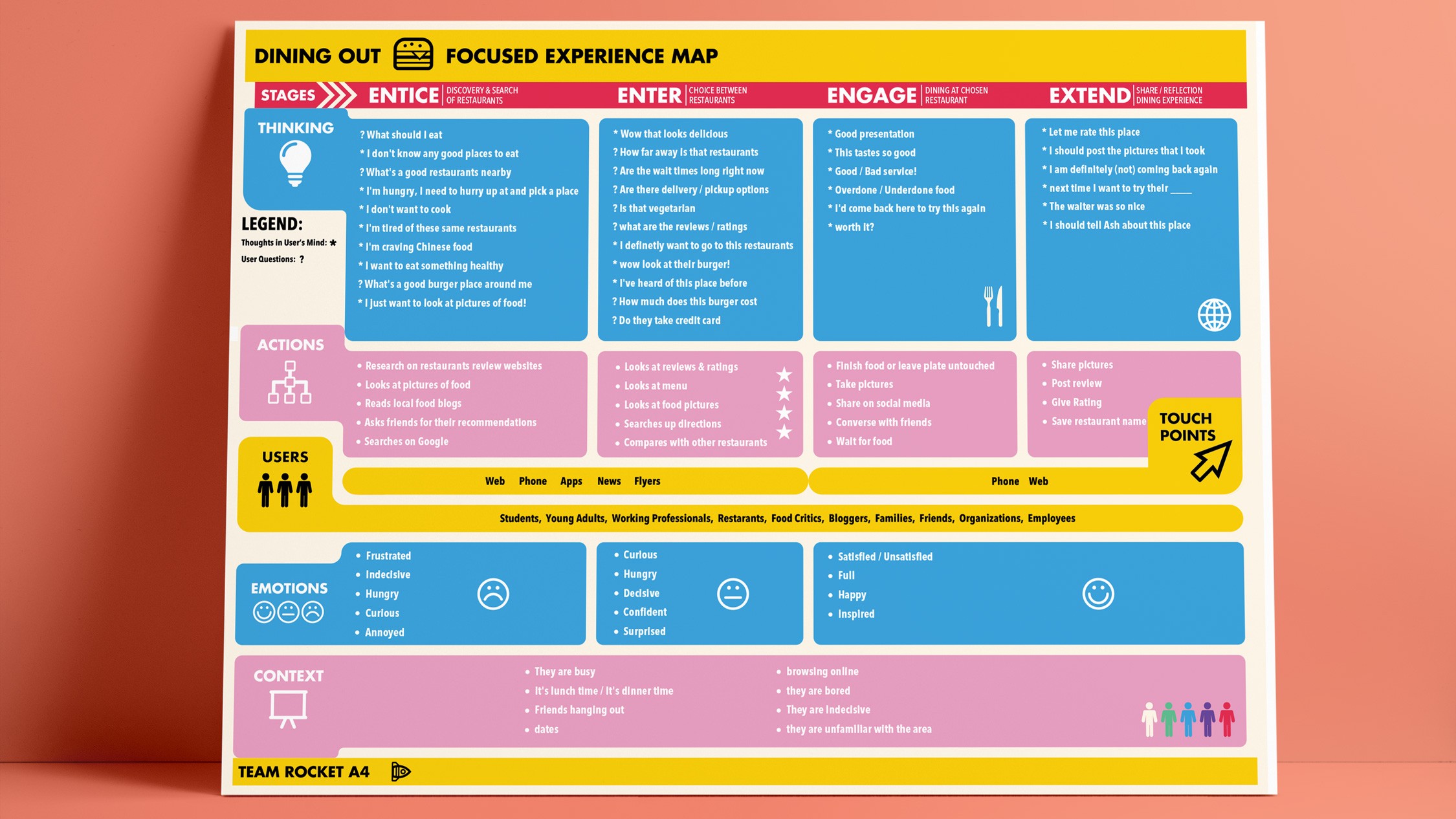
Choosing where to eat is a surprisingly complex and often frustrating experience. Users are faced with an overwhelming number of options, generic recommendations, and text-heavy interfaces that make it difficult to quickly decide.
Most existing platforms focus on reviews, ratings, and long lists, requiring users to invest time and effort before finding something that actually matches their cravings. This creates decision fatigue, especially when users are hungry and want something quick, relevant, and visually appealing.
The challenge was to rethink restaurant discovery from the ground up:
How might we reduce decision fatigue?
How can we better reflect how people actually choose food - visually and emotionally?
How can personalization feel intuitive rather than overwhelming?
This problem stood out because it sits at the intersection of utility and delight, an everyday experience with huge potential for improvement.
Solution
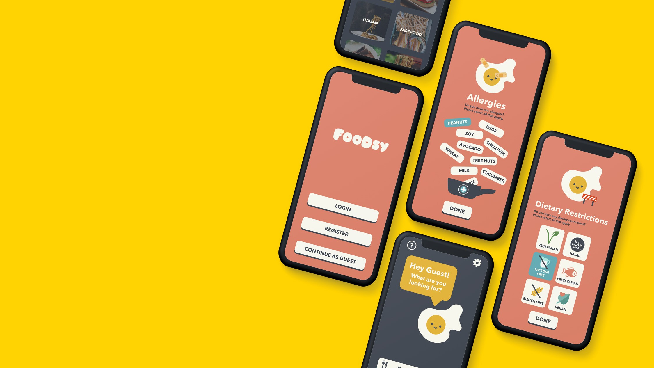
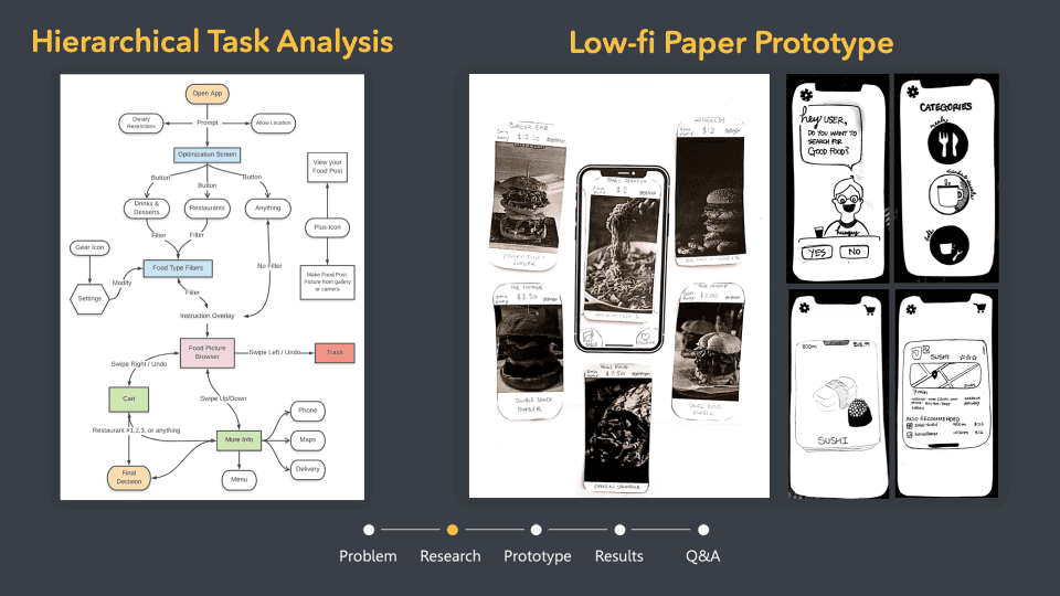
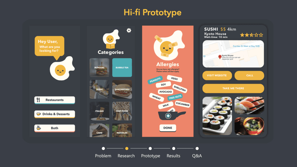
Foodsy reimagines restaurant discovery as a fast, personalized, and visually engaging experience. Instead of relying on endless scrolling and text-heavy lists, the app prioritizes imagery and user intent to guide decision-making.
At the core of the solution is a system that surfaces recommendations based on real-time cravings and dietary preferences. Users can quickly indicate what they’re in the mood for, and Foodsy responds with curated options that feel immediately relevant.
Key aspects of the solution include:
Visual-first browsing: High-quality food imagery helps users decide quickly and intuitively
Craving-based personalization: Recommendations adapt to what users feel like eating in the moment
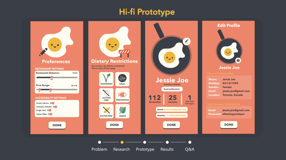
Dietary preference filtering: Seamless support for needs like vegan, gluten-free, or specific cuisines
Streamlined interactions: Minimal friction through simple gestures and quick decision flows
The goal was to transform a typically overwhelming process into something fast, enjoyable, and even a little fun.
Conclusion
Foodsy successfully reframes restaurant discovery by reducing friction and centering the experience around how people naturally make food decisions. By prioritizing visuals and personalization, the app helps users move from indecision to confidence in just a few taps.
Beyond the final product, this project was a valuable opportunity to strengthen my skills in product thinking, interaction design, and designing for real-world behaviors. I learned the importance of balancing simplicity with meaningful personalization, and how small interaction choices can significantly impact user experience.
This project reinforced my passion for solving everyday problems through thoughtful design—and my belief that even the smallest decisions, like choosing what to eat, deserve a better experience.